Papa John's Usability Testing
I conducted in-person moderated usability testing for PapaJohns.com, uncovering key design improvements to streamline ordering, simplify sign-ups, and make customer support more accessible—transforming a functional site into a more engaging and user-friendly experience.
Overview:
Client: Papa John’s
Project Type: User Experience & Usability Testing
Focus Areas:
- Online ordering process
- Email deal sign-up flow
- Access to corporate customer service
The Challenge:
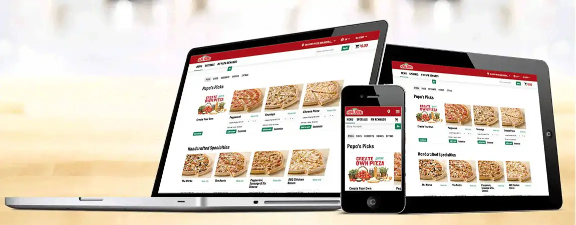
Papa John’s wanted to improve the online ordering experience, increase sign-up rates for deals, and make corporate support easier to find. While the site functioned well, leadership suspected subtle usability issues were causing friction and missed engagement opportunities.
My Process:
I led in-person moderated usability testing with four experienced online pizza customers. Each participant completed three core tasks:
- Order three customized pizzas.
- Sign up for email deals.
- Contact corporate customer service.
I recorded sessions, observed behavior, tracked task completion times, and conducted post-task interviews. Using affinity mapping, I organized observations into key insights and actionable recommendations.
Results:
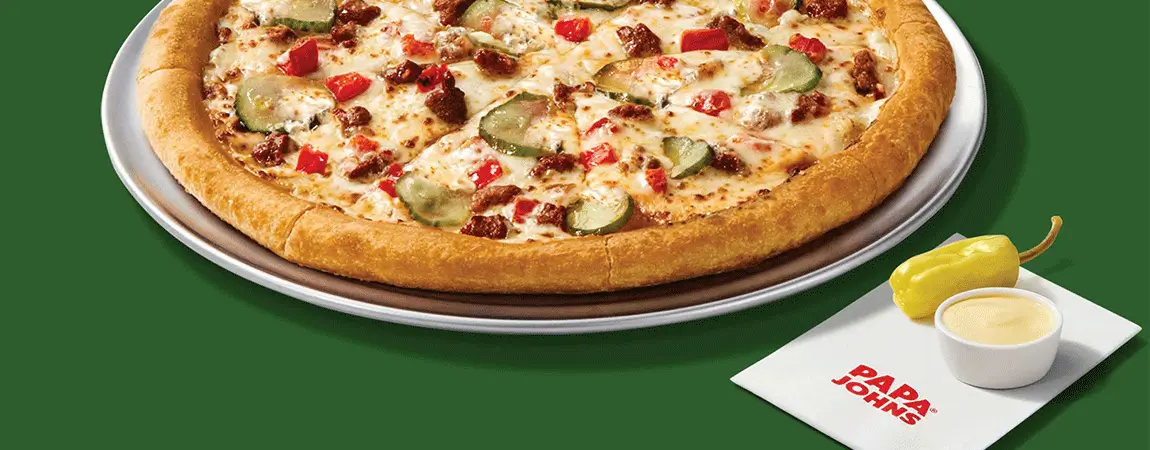
1. Ordering pizza is a non-memorable experience
Users found the ordering process “simple” and “standard” despite minor friction. Delight elements—like pizza animations—were effective mood boosters.
Recommendation: Introduce more subtle surprise-and-delight moments throughout the journey.
2. In the absence of clear signals, users create—and stick to—their own process
Confusing terms like “normal cut” vs. “clean cut” slowed progress. Users adapted quickly and repeated their chosen method.
Recommendation: Simplify terminology and surface customization options earlier.
3. Personal info and time are highly valued
The email sign-up process was hard to locate, and users were unsure what data was required.
Recommendation: Minimize required fields, clearly state what’s mandatory, and enhance perceived value (e.g., instant reward).
4. Users follow standard web patterns
Participants instinctively searched the footer for customer service links. Misplaced or mislabeled elements caused confusion.
Recommendation: Lean into familiar web conventions and avoid repurposing common UI patterns in misleading ways.

Lessons Learned:
Users create their own process when cues are unclear—and repeat it on future visits.
Clear terminology and familiar UI patterns reduce decision fatigue.
Delightful micro-interactions can make a transactional process more engaging.
Conclusion:
This study uncovered small but impactful design changes that could improve efficiency, engagement, and satisfaction. By addressing these friction points, Papa John’s can turn a functional site into a memorable, loyalty-building experience.
––––––––––